The visible image of Pluto
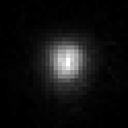
A close-up of Pluto.
The image below is a 31x31 pixel extraction from the original image
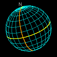
that is centered on Pluto. Next to the Pluto image is a picture that
shows a latitude and longitude grid for the orientation of Pluto in the
image.


The size for this figure does not match the size of Pluto in
the image to the left. I've enlarged the globe so you can see the grid
lines. The yellow line is the equator of Pluto and I've marked the North
pole. Notice that we can't see the south pole in this image. The orange
line is a meridian that marks the center of the hemisphere on Pluto that
faces away from Charon. Where the yellow and orange lines cross is
exactly opposite of Charon. The grid lines are spaced at 15 degree
intervals.
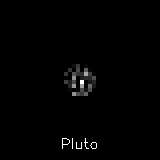
Now let's put these two together. The image below comes from overlaying
the wire frame grid on top of the image. This time we are just looking at
a 13x13 pixel grid.

Are you surprised at this? I bet you would have thought Pluto was
bigger. If you look closely at this image, you see that there are pixels
outside the edge of the wire-frame globe that are not black. Where's the
light coming from for these pixels? This light does not come from Pluto's
atmosphere. It also isn't from an incorrect size for Pluto.
The answer is that the image is blurred by the finite resolution of
the Hubble Space Telescope. Does that mean HST is not working right?
Not at all. Every telescope has some limit beyond which it cannot be
pushed and HST is no exception. That limit is known as the diffraction
limit and is governed
by fundamental properties of light. What you see in this picture is
that Pluto is just barely bigger than the diffraction limit of HST.
As a result, Pluto is blurred out, ever so slightly. The next step will
be to remove the effects of this blurring.
What is a PSF?
The acronym, PSF, stands for Point-Spread Function. The name comes from
what it does. If you put a point source image into the telescope, you
never get a single point out the back end. What's a point source? Well,
it's one of these special mathematical constructs that doesn't really exist.
A point source is something that is infinitely small but of finite
brightness. We usually use stars as point sources. They aren't infinitely
small, but they are so far away that they are usually indistiguishable from
a point source.
Where were we? Oh yes, so you put a point source into the telescope
and you get out..., that's right, a point-spread function. Another way
to think of this is that a telescope (or any camera for that matter) will
blur the image it sees. The blurring function is the PSF. Here, take a
look at the PSF for HST with its Faint Object Camera.


The image on the left is a "normal" view of the PSF. I say normal
because I haven't played any image processing tricks to change how it
looks. You can see the one pixel in the center is the brightest and its
nearest neighbors are considerably fainter and the rest appear black.
The image on the right is a stretched version that brings out detail in
the darker areas. This PSF show the blurring that is present in the Pluto
image that keeps it from looking like a nice sharp disk. The next step
in processing the Pluto data is to remove this blurring from the image.
Removing the PSF
The process of removing the PSF is easy to visualize but harder to do.
If you write the problem like one of those 1st grade math problems it looks
like this:
Pluto BLURRED_BY psf = Image
"BLURRED BY" is similar to an operation like addition or subtraction
(its formal term is "convolved with"). "Image" is the image of Pluto that
we got from HST. "Pluto" is the image of Pluto that we want to get. We
know "psf", "Image", and how to blur the image. All we need to do is fill
in the blank and find the Pluto image that satisfies this equation.
I have a program developed for the 1994 Pluto observations that allows
me to solve this equation. This program takes many hours to run and get the
answer. I also discovered a minor flaw in my older program when running these
new images through. These two things when put together meant this step
took over four days for me to get the answer out.
The following pictures show the above equation as images:


If you look really careful, you will notice that the Image on the right
is not the original image earlier on this page. It is very, very close to
the same image but not exactly.
Converting to a map
What we really want to know is where on Pluto's surface are all these
light and dark patches. Let's zoom in on the Pluto picture from the
previous step. I'll also draw the wire frame globe on top of the image
so you can see where things are. Remember, the yellow line is the
equator and the orange line is 180 degrees longitude.

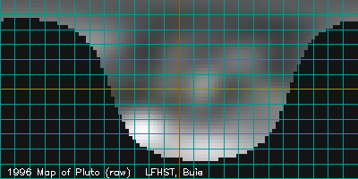
The next step is to unwrap the image above re-displaying the image as a
flat map. You can almost see how you could read off the brightness at
a given latitude and longitude using the gridlines as a guide, then on the
map you put down that brightness. The rectangular image below is the
result of reprojecting the image onto a map.

All the black areas (just over half this map) are regions that are
on the back side of Pluto when the picture was taken. You can see now
why we would have needed all three of the LFHST orbits to make a complete
map. Now, I bet you're thinking this map (and the above image) look
pretty strange. These light and dark patterns look something like farm
plots would here on Earth. This apparent structure is caused by how I
set up the computer programs and not by anything on Pluto itself. The
next step is to turn this into a more realistic portrait of the
surface. The next image comes from smoothing out the blocky map to remove
these artificial edges.

This is about as far as we can go with our new data by itself. The
next step is to compare this against the map from 1994.

Back to my home page,
Pluto page,
LFHST page,
Analysis Table of Contents.
Marc W. Buie, Southwest Research Institute
